
MSRVS style guide: the full guide#
How the Model Steam Road Vehicle Society looks, on the website, in print and anywhere else. It is the authority on the Society's colours, type and artwork: where something else disagrees with this guide, this guide wins.
Making a poster or a post? The basics has all you need. This full guide is for designers, printers and whoever looks after the website.
Every file named here is in the file list. The values come from tokens.json, and the colour, type and contrast tables are generated from it, so they always match.
- The look
- Name and wording
- Logos
- Colour
- Type
- Ornament and layout
- Photography
- Using it: website, email, social media, print, merchandise
1. The look#
Heritage editorial. The colours come from the club emblem and from the engines themselves: steam blue and brass, on warm cream paper. Headings are set in a serif, and fine brass double rules echo the lining-out on an engine's panels. Photographs of members' engines carry the pages.
Keep it calm. Cream does most of the work, blue gives the structure, brass is the accent and crimson is rare. As a rough guide for a page or a sheet:
- cream and light surfaces: about 60%
- the blues: about 25%
- text: about 10%
- brass: 5% or less
- crimson: a touch, if at all
2. Name and wording#
- Model Steam Road Vehicle Society in full; MSRVS for short, without full stops. In running text, "the Society".
- Founded in 1985.
- British English, sentence case for headings, buttons and menus ("Join the Society", not "Join The Society").
- Makers' names as they wrote them: Aveling & Porter, Wallis & Steevens, Clayton & Shuttleworth. Engine types in lower case: traction engine, road roller, showman's engine.
- Scales with the inch mark: 1½", 4½". Write "4½-inch" if the mark could be lost, for example in a URL or file name.
3. Logos#
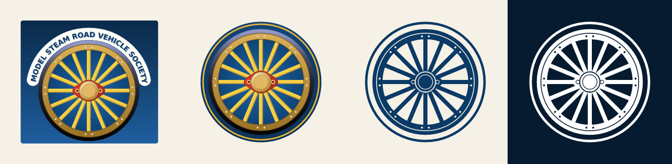
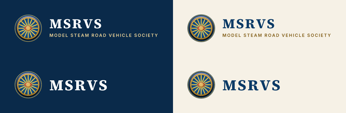
| Artwork | What it is | Use it for |
|---|---|---|
| Emblem | The wheel on its blue panel, under the lettered ribbon | Formal and full-size uses: programme covers, certificates, stand banners, share images |
| Mark | The wheel on a blue disc with a brass ring | Small or square spaces: the website footer, profile pictures, the favicon, app icons, beside a heading |
| Lockup | The mark with MSRVS and the full name | The website header, letterheads, email, anything that needs the name as well as the mark |
| Compact lockup | The mark with MSRVS | Where the full name would be too small to read: the forum header, narrow spaces |
| One-colour mark | The wheel in a single ink | Embroidery, engraving, rubber stamps, one-colour print |
Each lockup comes in two versions. On dark has white and light-brass lettering, for deep steam blue, night blue or a darkened photo. On light has steam blue and dark-brass lettering, for cream or white. The emblem and the mark carry their own blue ground, so they work on either.
Files#
All lettering is converted to outlines, so no fonts are needed to open the artwork.
- SVG (
dist/logo/svg/) wherever it's accepted: websites, print shops, sign makers, Canva, Word and PowerPoint. - PNG (
dist/logo/png/) where SVG isn't accepted. Useemblem-2400.pngandmark-1024.pngfor print. - Use these files rather than older scans of the emblem, which are too low in resolution for most uses.
Clear space#

Leave clear space of a quarter of the mark's diameter around the mark and the lockups (the small square above), and an eighth of its width around the emblem. Nothing else goes inside it: no text, no other logos, no edge of the page.
Minimum sizes#
| Artwork | On screen | In print |
|---|---|---|
| Emblem | 180 px wide | 40 mm wide |
| Mark | 24 px (16 px only as a favicon) | 8 mm |
| Lockup with the full name | 56 px tall | 15 mm tall |
| Compact lockup | 28 px tall | 8 mm tall |
| One-colour mark | 24 px | 8 mm; 40 mm for embroidery |
Below these sizes the spokes fill in or the full name can't be read. If the lockup has to be smaller, use the compact one.
Don't#
- Don't redraw the artwork, or retype the lettering in another font.
- Don't stretch, squash, rotate or crop it, or move the mark and the name apart.
- Don't recolour the full-colour artwork. For one colour, use the one-colour mark.
- Don't add shadows, glows, outlines or bevels.
- Don't put a lockup straight onto a busy photo. Darken the photo first (photo overlays) or put the lockup on a solid panel.
- Don't use the "on dark" lockup on a light ground, or the "on light" one on a dark ground.
4. Colour#
Brand palette#
| Colour | Hex | RGB | Use | LESS / CSS | |
|---|---|---|---|---|---|
 |
Steam blue | #0B3A66 |
11 58 102 | Links on light surfaces, the facts strip, secondary buttons, the lockup lettering on light backgrounds | @msrvs-steam-blue --msrvs-steam-blue |
 |
Brass | #E3B23C |
227 178 60 | Primary buttons, lining-out, rules and accents. Never text on a light surface | @msrvs-brass --msrvs-brass |
 |
Cream | #F6F1E6 |
246 241 230 | Light-scheme page background; paper colour for print | @msrvs-cream --msrvs-cream |
 |
Deep steam blue | #0A2A4A |
10 42 74 | Header (light scheme), plain heroes, the membership band | @msrvs-deep-blue --msrvs-deep-blue |
 |
Night blue | #071B30 |
7 27 48 | Footer, behind hero photos, header (dark scheme), text on brass | @msrvs-night-blue --msrvs-night-blue |
 |
Dark brass | #7F5B14 |
127 91 20 | Brass-coloured text on light surfaces: eyebrows, small labels | @msrvs-brass-dark --msrvs-brass-dark |
 |
Light brass | #F1D79A |
241 215 154 | Brass-coloured text on blue; links in the dark scheme | @msrvs-brass-light --msrvs-brass-light |
 |
Crimson lake | #A12A2B |
161 42 43 | Date tiles and the odd highlight. Sparingly, and never as text on a dark surface | @msrvs-crimson --msrvs-crimson |
 |
White | #FFFFFF |
255 255 255 | Text on blue | @msrvs-white --msrvs-white |
- Text on light surfaces is near-black (
textbelow). Brass is never text on a light surface; use dark brass. - On blue, text is white, or light brass for an accent.
- Brass buttons take night-blue text.
- Crimson is for date tiles and the odd highlight, and is never text on a dark surface.
Light and dark schemes#
The website has a light and a dark scheme. These are the roles, with each scheme's colour. surface and sunk are derived from page in the same way Flarum derives them, so they match the forum exactly. In LESS each role is @msrvs-light-<role> and @msrvs-dark-<role>. In CSS it is --msrvs-<role>, which switches with the scheme.
| Role | Light | Dark | Use |
|---|---|---|---|
page |
#F6F1E6 |
 #0C1520 |
Page background |
surface |
 #FDFCF9 |
 #132133 |
Cards, panels, dropdowns. Flarum derives this (--body-bg-light) |
sunk |
 #F2EBDB |
 #080E15 |
Alternate sections. Flarum derives this (--body-bg-shaded) |
control |
 #ECE4D3 |
 #172434 |
Control backgrounds, borders, dividers |
control-text |
 #5C5447 |
 #B5AC9C |
Text on controls |
text |
 #1E1B16 |
 #EDE6D8 |
Body text and headings |
muted |
 #6E6455 |
 #A0978A |
Secondary text |
subtle |
 #766B59 |
 #7F8996 |
Least important text (Flarum's muted-more): list metadata, placeholders |
read-title |
#6E6455 |
#A0978A |
Titles of discussions already read (Flarum's --discussion-title-color) |
link |
#0B3A66 |
#F1D79A |
Links |
accent-text |
#7F5B14 |
#E3B23C |
Eyebrows and other brass-coloured text |
code |
 #EFE8D9 |
 #101C2A |
Code and quote backgrounds |
header |
#0A2A4A |
#071B30 |
Site header |
header-text |
#FFFFFF |
#FFFFFF |
Header text |
The header is blue in both schemes.
Livery colours#
Each primary forum tag has a livery colour, named after the paints and metals of the engines. Child tags have no colour of their own and read as part of their parent. Secondary tags (engine type, maker, scale) have no colour or icon.
| Livery | Hex | Tag | Icon | As an icon or text: light / dark | Label text | |
|---|---|---|---|---|---|---|
|
Brass | #E3B23C |
Announcements | fas fa-bullhorn |
 #7E5E00 / #E3B23C |
dark |
|
Crimson lake | #A12A2B |
Rallies & Events | fas fa-calendar-days |
#A12A2B /  #EF736C |
cream |
 |
Brunswick green | #1F5C3A |
Workshop | fas fa-screwdriver-wrench |
#1F5C3A /  #72AE88 |
cream |
 |
Chocolate | #6B4226 |
Marketplace | fas fa-shop |
#6B4226 /  #C29375 |
cream |
 |
Verdigris | #296E66 |
Chit Chat | fas fa-mug-hot |
#296E66 /  #6AADA4 |
cream |
|
Steam blue | #0B3A66 |
Blog | fas fa-newspaper |
#0B3A66 /  #74A2D6 |
cream |
 |
Slate | #5B6875 |
Using This Site | fas fa-life-ring |
 #586572 /  #92A0AE |
cream |
Livery colours as icons or text. As a background, such as a tag label or a hero, a livery colour is used as it is. As a foreground, such as a tag's icon or an active link, it keeps its hue and chroma, but its OKLCH lightness is held at or below 0.5 on light surfaces and at or above 0.7 on dark ones. Colours already in range pass through unchanged. In CSS, with the colour in --color:
.tag-icon {
  color: var(--color);
}
/* A fallback line doesn't work here: a declaration with var() in it is only
   checked once computed, so an unsupported one leaves the colour unset. */
@supports (color: oklch(from red l c h)) {
  .tag-icon {
    color: oklch(from var(--color) min(l, 0.5) c h);
  }
  [data-theme^="dark"] .tag-icon {
    color: oklch(from var(--color) max(l, 0.7) c h);
  }
}
The "as an icon or text" column above gives the exact results. Label text is the colour Flarum puts on a label of that colour: cream on the darker liveries, dark on brass.
Group colours#
| Group | Hex | Icon | |
|---|---|---|---|
 |
Site Admin | #4A148C |
fas fa-shield-halved |
 |
Committee | #0D47A1 |
fas fa-users |
 |
Chairman | #3E2723 |
fas fa-crown |
 |
Treasurer | #1B5E20 |
fas fa-coins |
 |
Boiler Tester | #BF360C |
fas fa-gauge-high |
 |
Rally Co-ordinator | #00695C |
fas fa-calendar-days |
These are the colours the forum's groups have today. Their badges carry their own icon colour, so they don't need the foreground rule.
Contrast#
Everything that can be read meets WCAG AA, 4.5:1, including small text such as the date and author under a discussion title. Decorative rules and borders are exempt. Before changing any colour, run uv run msrvs check; the build refuses to run if a pairing fails.
All 107 pairings pass. The closest is scheme.dark.subtle on scheme.dark.surface at 4.58:1 (needs 4.5:1). Every pairing is listed in guide/contrast.md.
Colour in print#
The hex values are the masters; no CMYK or Pantone values are set yet. Send the printer RGB artwork (SVG or PDF) and let them convert it with their own profile. UK printers usually use FOGRA39 or PSO Coated v3 for coated paper. Ask for a proof whenever the brass or steam blue matters, because brass prints flatter and browner, especially on uncoated paper. If a printer matches a spot colour, add the Pantone reference they proofed to this guide.
5. Type#
| Typeface | Role | Weights | Licence |
|---|---|---|---|
| Source Serif 4 | Headings, the wordmark, display figures | 600 and 700 | SIL Open Font License |
| Inter | Body text, interface, eyebrows, buttons | 400 to 700 | SIL Open Font License |
Both are free for any use, including print, merchandise and embedding in PDFs.
- For websites: the subsetted web fonts and a ready-made
@font-facestylesheet are indist/fonts/(fonts.css). - For desktop and print work: install the full families from Google Fonts (Source Serif 4, Inter).
- Where you can't install fonts, in Word documents and emails for example, use Georgia for headings and Arial for body text. Both are on almost every computer.
Styles#
| Style | Font | Weight | Size | Line height | Tracking | Case |
|---|---|---|---|---|---|---|
display |
Source Serif 4 | 700 | clamp(34px, 3.4vw + 14px, 62px) |
1.15 | -0.01em | as written |
h2 |
Source Serif 4 | 700 | clamp(26px, 2.2vw + 14px, 36px) |
1.15 | -0.01em | as written |
h3 |
Source Serif 4 | 600 | 20px |
1.25 | -0.005em | as written |
body |
Inter | 400 | 16px |
1.6 | 0 | as written |
small |
Inter | 400 | 14px |
1.5 | 0 | as written |
button |
Inter | 600 | 15px |
1 | 0 | as written |
eyebrow |
Inter | 600 | 12px |
1 | 0.16em | uppercase |
wordmark |
Source Serif 4 | 700 | to fit | 0.08em | uppercase | |
subline |
Inter | 600 | to fit | 0.17em | uppercase |
- Headings are serif, in sentence case. Capitals are kept for the wordmark, the society name in the lockups and eyebrows.
- Body text is Inter 400 at 16 px on screen with a line height of 1.6, in lines of 60 to 75 characters.
- Eyebrows are short labels above a section heading, such as "WHAT'S ON". They are set in Inter 600, 12 px, uppercase, tracked 0.16em, in dark brass (brass on dark grounds), after a 28 px rule. Use one per section at most.
- Use tabular figures (
font-variant-numeric: tabular-nums) in tables, dates and prices. - Sizes for print and screen:
| Text | Font | In print | On screen |
|---|---|---|---|
| Headings | Source Serif 4 Bold | 18–36 pt | 26–62 px |
| Body text | Inter Regular | 9.5–11 pt | 16 px |
| Captions and small print | Inter Regular | 8–9 pt | 14 px |
6. Ornament and layout#
Lining-out#
The signature detail: a fine brass double rule, like the lining on an engine's panels. It has three parts: a 1 px brass line at 75%, a 4 px gap in the surface colour, then a 1 px brass line at 40%. Use it on one feature per page, such as the membership card on the join page, a certificate's border or a programme cover. Lining-out on everything stops it being special.
Rules, cards and corners#
- Rules: a 1 px line of brass at 35% runs under the header and the heroes.
- Cards: the surface colour, a 1 px border in the control colour, 10 px corners and a soft shadow.
- Corners: 6 px on controls and inputs; 10 px on cards, dialogs and dropdowns; fully rounded (pill) on calls to action in heroes and bands.
- Layout: content up to 1200 px wide, with 24 px gutters. The header is 68 px tall, or 56 px on phones.
Icons#
Font Awesome 6 Free, solid style, which is what the forum uses. The tag icons are listed in Livery colours. An icon sits beside a label; it doesn't replace one.
Photo overlays#
Text never goes straight onto a photo. Lay night blue over it first:
- Centred text: night blue at 82% at the top, fading to 64% at the bottom.
- Text set left: night blue at 92% on the left, fading to 72% by 42% of the width and 15% by 75%, with 55% added along the bottom. This keeps the right of the picture visible.
Recipes#
For websites other than the forum, link dist/tokens/msrvs.css and dist/fonts/fonts.css, then:
body {
  background: var(--msrvs-page);
  color: var(--msrvs-text);
  font: 400 16px/1.6 var(--msrvs-font-sans);
}
h1, h2, h3 { font-family: var(--msrvs-font-serif); color: var(--msrvs-text); }
a { color: var(--msrvs-link); }

.eyebrow {
  display: inline-flex;
  align-items: center;
  gap: 10px;
  font: var(--msrvs-type-eyebrow-weight) var(--msrvs-type-eyebrow-size)/1 var(--msrvs-font-sans);
  letter-spacing: var(--msrvs-type-eyebrow-tracking);
  text-transform: uppercase;
  color: var(--msrvs-accent-text);
}
.eyebrow::before { content: ""; width: var(--msrvs-eyebrow-rule); height: 1px; background: currentColor; }

.card {
  background: var(--msrvs-surface);
  border: 1px solid var(--msrvs-control);
  border-radius: var(--msrvs-radius-card);
  box-shadow: var(--msrvs-card-shadow);
}

.lined {
  border: 1px solid var(--msrvs-lining-outer);
  box-shadow: inset 0 0 0 var(--msrvs-lining-gap) var(--msrvs-surface),
              inset 0 0 0 calc(var(--msrvs-lining-gap) + 1px) var(--msrvs-lining-inner);
}

.button-primary {
  min-height: 46px;
  padding: 0 22px;
  border: 0;
  border-radius: var(--msrvs-radius-pill);
  background: var(--msrvs-brass);
  color: var(--msrvs-night-blue);
  font: var(--msrvs-type-button-weight) var(--msrvs-type-button-size)/1 var(--msrvs-font-sans);
}

.photo-hero { position: relative; background: var(--msrvs-night-blue); color: var(--msrvs-white); }
.photo-hero::after { content: ""; position: absolute; inset: 0; background: var(--msrvs-photo-overlay); }
.photo-hero > * { position: relative; z-index: 1; }
The dark scheme follows the visitor's system setting. To force a scheme, set data-theme="light" or data-theme="dark" on <html>, as Flarum does.
7. Photography#
Photographs of members' engines are what make the Society look like itself. Real club photos always beat stock.
What to shoot#
- Engines in steam and at work: on the road, on the rally field, ploughing, rolling.
- Members with their engines: at the regulator, firing up, polishing, in the workshop.
- Builds in progress: castings, machining, boilers, the first steaming.
- Details: brass, lining-out, gauges, makers' plates, smoke and steam.
- Club events: club nights, steam-ups, the AGM, the Society's stand at a show.
How#
- Landscape for anything that might be a hero or a banner, with some quiet space (sky, grass, a plain wall) to one side of the subject. Homepage and join-page text sits on the left, so keep the subject to the right of centre.
- Sharp and well exposed, with no filters, heavy HDR, borders or watermarks, and no text added to the photo.
- Heroes and banners: at least 2400 px across. Cards and articles: at least 1200 px.
- JPEG in sRGB. To prepare a photo, run
uv run msrvs photo original.jpg ready.jpg. It straightens it, converts it to sRGB, resizes it to 2400 px and removes the camera data, including any GPS location.
Permission and credit#
- Only use a photo with the photographer's permission, and credit them in the caption where there is one.
- Anyone who can be recognised should be happy to appear. For under-18s, get a parent's or guardian's consent in writing first.
- Keep a note of who took each photo and who gave consent.
- Write alt text that says what the photo shows: the maker, the type and the scale, the engine's name if it has one, and what is happening. For example: "A 4½-inch Burrell showman's engine in steam on the rally field".
8. Using it#
The website (Flarum)#
The forum is themed by the ianm/msrvs extension, which takes its values from this guide's exports (see the file list). Anyone styling the forum works within these rules:
- Theme through Flarum's own variables. The extension imports
msrvs-tokens.lessand maps it onto Flarum's LESS variables (@body-bg-light,@control-bg-dark,@text-color-light,@header-bg-lightand the rest), so core and other extensions pick the colours up in both schemes. Keep bespoke custom properties to a minimum. Never copy hex values into the extension by hand. - Leave the brand slots to the admin panel. The logo, favicon and email logo are uploaded in Admin → Appearance and Admin → Email, and the share image in Admin → SEO (files in
dist/flarum/admin/). They are never overridden with CSS or<head>tags. No dark-mode logo is needed, because the header is blue in both schemes. The extension adds only what has no slot: the home-screen icons and the web app manifest. - Reuse core components (Hero, DiscussionListItem and so on) rather than hand-built look-alikes, and style them through the theme.
- Tag colours are entered in Admin → Tags using the livery hex values. Child and secondary tags are left without a colour. Tag icons follow the livery foreground rule.
- Every hero is core's Hero. Photo heroes use the admin-set hero photo with the night-blue overlay.
Email#
Flarum's emails are white, so they use the "on light" lockup (email-logo.png). In email templates, use web-safe fallbacks: Georgia for headings, Arial for body text, and steam blue for links.
Website icons#
dist/icons/ holds the full set for any website: the favicon (.ico, SVG and PNG), the Apple touch icon, the Android icons, a maskable icon and a web app manifest. Serve them together from the site root, and add:
<link rel="icon" href="/favicon.ico" sizes="32x32">
<link rel="icon" href="/favicon.svg" type="image/svg+xml">
<link rel="apple-touch-icon" href="/apple-touch-icon.png">
<link rel="manifest" href="/site.webmanifest">
All the icons use the mark. The Apple touch icon and the maskable icon sit it on deep steam blue, because iOS and Android fill any transparency themselves.
Social media#
- Profile picture:
dist/social/avatar-1024.png, the mark on night blue, which survives a circular crop. - Share images (what appears when someone shares a link): the emblem on its blue, inside a brass lining-out frame.
share-1200x1200.pngis square.share-1200x630.pngis the shape Facebook, LinkedIn and X use for link previews; they crop a square image to that shape. - Cover images: a club photo, darkened with the overlay if the compact lockup or any text goes on it.
- Post photos as they are, without frames or logos stamped on them.
Print#
- Cream or white paper. Use the emblem on covers and certificates, and the lockup on letterheads and flyers.
- Headings in Source Serif 4, body text in Inter (see Type), with lining-out as the border on certificates and membership cards.
- Supply artwork as SVG or PDF, and check the minimum sizes and the colour notes.
Merchandise, signage and regalia#
- Embroidery: use the one-colour mark, at least 40 mm across, in brass, cream or white thread on a dark garment, or steam blue on a light one. Embroidery can't reproduce the gradients in the full-colour artwork. If the embroiderer wants it simpler, they may leave out the rivets.
- Engraving and etching, for example on brass plates: the black one-colour mark (
mark-mono-black.svg). - Banners and stand boards: the emblem large on steam blue or night blue, with the society name in cream or light brass, and the clear space kept.